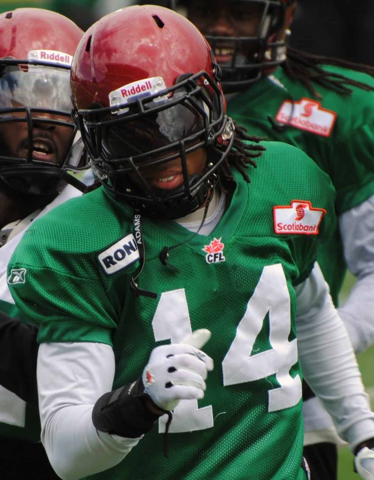
What the hell are they wearing?

Autumn McDowell takes down your latest dumb purchase- What the balls?
Article: Autumn McDowell – Contributor
With hockey season not officially dropping the puck for another month and a half, all of the attention in Canada is focused on football.
This is nothing new for Rider fans, being that the Saskatchewan Roughriders are the only thing that the people of Saskatchewan have to cheer about for miles, the Riders have been getting all the attention, as per usual. The only difference this year is that something else is trying to steal the spotlight: Their hideous new uniforms.
In an apparent cash grab, Reebok has recently released a series of third jerseys for CFL teams, and while many of them are incredibly ugly, the Riders jerseys have a look that only a mother could love.
The fact that multiple people had to sign off on the design for these jerseys is still mind boggling to me, because instead of implementing an ultra-cool and intimidating matte black finish like the BC Lions had, we got some garbage that apparently is supposed to be wheat, but clearly makes the team look like a bunch of cowardly watermelons running onto the field.
Why they decided to go with wheat, the most unintimidating, boring, flat object to be the central point of the jerseys is beyond me. I mean, I realize that they are a staple for Saskatchewan but wheat, on a football jersey, really? The wheat theme doesn’t just stay on the jerseys either, it also makes an appearance on the helmets, though I am still sure those are meant to resemble the classic watermelon that fans always wear on their heads at games. Writing that out on paper just made me realize how ridiculous it is that thousands of people willingly put watermelons on their heads in an attempt to show support for football.
The other thing about this whole jersey fiasco that is beyond me is that people are actually buying this monstrosity, lining up in fact, to get their hands on this piece of crap, because in their minds having the Riders newest merchandise before everyone else makes them a hardcore fan, no matter what it looks like.
By putting so much energy, time, and crap into one jersey, it appears that other teams in the league have also suffered in the jersey department. The Toronto Argonauts jerseys seemed rushed, as just a simple gradient, that any amateur designer could create was used. And that’s about it to transform their new look. The Winnipeg Blue Bombers got a new type of horrendous blue camouflage, bowling balls for helmets, and were without their other signature colour, gold. Thus, making them look an awful lot like Toronto at first glance, until you see them play that is and realize they are much better.
The only people that I can point my finger at for creating this hideous Roughriders uniform is Reebok. By trying to cram as much crap onto one jersey as humanly possible, they have created something that has terrified many Riders fans, more so than when Chris Milo is up to kick an important field goal, which is saying a lot.
Reebok, you’re fired.


