Are you ready to step up your art game?
Welcome back to digital art tips & tricks! I wrote the first of this series almost a full year ago in February of 2022, so it’s time for a sequel. Since then, I’ve learned a lot more about art and drawing. Last time I discussed general topics, but this time I’m going to get more specific.
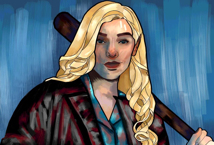
As a reminder, I make semi-realistic portraits. This advice is going to be more about making portraits, creating faces and people.
Eyes
This is going to sound a little bit weird, but eyes are wet. It’s true, they are. Reflect that in your drawing to make your eyes more realistic. When I draw eyes, I use a pixel art pen and a white tone on the lower lash line to create little dots to show that the eyes are wet.
Eyes are also round. There needs to be a shadow all the way around to show their roundness. I use a blue multiply layer to create a thicker shadow on the top half of the eye, and a much smaller one on the other half. It adds dimension to the eye to create a shadow.
Sometimes I forget this, but the upper eyelid is not one giant thick black line. I try to draw it as a thin black line, closer in size to the lower eyelid, and use a soft black brush to create an eyeliner effect on a layer lower than the outline of the eye itself.
Nose
I hate rendering noses. There’s something about it that’s so difficult. I have learned a few things about drawing them.
To start, nostrils aren’t perfect circles, they’re teardrop shaped. I use a blur brush to soften out the lower edge of the nostril.
Don’t make the entirety of the lower nose the same colour. I have been guilty of doing this until very recently. Look up some pictures of noses. Part of the lower nose and the nostril sides have more of a shadow, and part of it has more of a highlight. Don’t forget about the shadows and highlights. It’s another small thing that’ll add dimension to the face and make the nose look less flat.
Mouth
Do you remember watching Kim Possible as a kid and seeing how only the top lip is filled in? That’s how I start when rendering lips. Add a base colour to the top lip and then shade in a shadow on the bottom lip, blend it out, and then start rendering the rest of the lips.
Hair
Drawing hair is scary; it’s very intimidating. Here’s how I make it less intimidating.
Start with sections. Hair falls down in sections, not one big piece. You can try drawing strand by strand, but I would not recommend that. It’ll take a long, long time, and you’ll get easily frustrated if it doesn’t turn out the way you’d hoped. Instead, group chunks of hair together. Look at some pictures of hair and see how it falls down in sections.
Once you’re done drawing the hair, add some extra strands and some flyaways. It adds more realism and makes the piece feel softer. You can add as many as you want, but the more you add, the messier the hair will look.
Proportions
A simple proportion check can make sure everything is lining up. Remember, not every person will be within these proportions; it’s a basic guideline. Change it up a little to your liking, but this is a good starting point.
The bottom of your nose lines up with the bottom of your ear, and the top of your ear lines up with the middle of your eye. Speaking of the middle of the eye, the corners of the lips match up to the middle of each eye on either side.
Your hand is about the same size as your face when you put your hand up to it, and your foot is roughly the same size as your forearm when you put your foot up to it. If you T-pose with your arms, the length from fingertip to fingertip will be about the same as your height.
Colour scheme
Let your characters have a colour scheme, and keep it consistent. It’ll bring more life to your character and it’ll make sure that they’ll be recognizable every time you draw them. Make the colour scheme suit the character. If your character is bright and bubbly, don’t put them in dark neutrals unless you have a good reason. Make sure the colours work well together. Find a colour palette that looks good as a whole and works well for your character.
Line weight
If you’re an artist who creates lined work, add in some line weight! This will add tons of dimension to your piece. It’s an alternative way to show lighting too! Just follow the curves and lines of your sketch and make the lines thicker where there would be shadows, and thinner where there would be highlights.
Poses
Poses can be tricky, but they can also help a lot. The pose needs to suit the character. It would be strange to see a very happy, bubbly character sitting stoically in a portrait. Bring that character to life, give them something fun to do with their hands or give them a fun expression. Follow a curve of action to bring it to life even more! With that being said, if you think a character would suit a stoic sitting-down style, draw them like that. Remember, it’s your drawing and you know what’s best.
Try to avoid same pose syndrome. It’s like same face syndrome where every face looks the same but with poses. If every single drawing has the same pose, maybe it’s time to change things up a bit. My favourite stock image source is AdorkaStock and they have lots of great pose references to try!
That’s all for this time. Remember that all art is good art, and don’t let anyone stop you from creating something. The best art is art that exists in this world. And trust the process! The halfway point looking one way doesn’t mean the endpoint will look the same. Happy drawing!